

Date Published: 1st November 2017
Iain McIntosh is the longtime illustrator of the jackets of Alexander McCall Smith’s books. Read on for a Q&A with him about his work and process of working with Alexander.
Q: What attracted you to illustration, and what were your sources of inspiration?
A: I’ve drawn pictures for as long as I can remember. Before I entered primary school—when I was younger than five—I’ve memory of sitting at table listening to the radio and drawing, which exactly describes my daily routine nowadays.
I loved the illustrations in the BBC Radio Times magazine; although these were black-and-white, they were little gems of detail, interest and wit. The mixture of images with type always interested me, and I think I appreciated the skills of graphic designers shortly after I learned to walk.
Looking back, the illustrations that inspired me and continue to were by the likes of Eric Fraser, Edward Bawden, Eric Ravilious, Maurice Sendak, Edward Gorey and Osbert Lancaster. Ravilious is a hugely interesting figure of broad talent, and his work is fine art rather than illustration. So many people are artists nowadays—it’s been suggested the only people who are not artists are illustrators.
Q: What cover art were you drawn towards before you became an illustrator? Can you recall seeing a particular cover design that inspired you to try your hand at designing covers?
A: David Gentleman illustrated numerous covers for the New Penguin Shakespeare series in the1970s, which were around in the UK for decades. These are classic pieces of book cover illustration and design.
I enjoy the work of Milton Glaser, Seymour Chwast and Push Pin Studios; they can turn their hand to any graphic problem and produce something iconic.
Q: How did you first start out designing the cover art for the No. 1 Ladies’ Detective Agency series?
A: I’ve known Sandy for more than thirty years and been involved in all sorts of projects with him: from limited-edition short stories to the daily serial 44 Scotland Street. This series has appeared off and on since 2004 every weekday in the Scotsman newspaper and has involved illustrating episodes—hundreds of drawings produced to short deadlines.
Sandy encouraged me to try and come up with an image for The Saturday Big Tent Wedding Party. I’m not even sure I had an official commission. It was more of a speculative pitch that happily proved successful.
Q: Can you describe the process that goes into designing artwork for Sandy’s novels? Is there back-and-forth collaboration between yourself and Sandy?
A: It’s very much a collaboration. I meet Sandy regularly for soup and sandwich in a deli café in the New Town (Edinburgh New Town was mostly built in the late seventeenth century, as opposed to The Old Town of Edinburgh, which is considerably less new).
These lunches are very entertaining. We do some work, but Sandy’s conversation is very wide-ranging. He can come up with visual ideas very easily, and I usually scribble indecipherable sketches, which add to the confusion. If I’m not drawing on napkins, then I draw on scraps of paper brought along for the purpose. He throws out suggestions and ideas that I can build on. He would have made a good senior art director in an advertising agency, if you can imagine it.
Q: The artwork for the No. 1 Ladies’ Detective Agency series tends to be bright and colorful. Did you find that you were naturally drawn towards this style of art, or did it take some time to adjust?
A: I often illustrate in black-and-white or in a very limited palette, which reflects much of the work I’m involved in day to day: whisky packaging work and logos which need to reproduce legibly and easily. Some of these jobs can be technically rigorous. When I work on the No. 1 Ladies’ Detective Agency series, it feels like a holiday for me. I’m sure it uses a different region of my brain, and I’m determined to use as much colour ink as the printer has in stock.
Q: What kind of impression do you want to leave with Sandy’s readers when they look at the No. 1 Ladies’ Detective Agency covers?
A: I’ve always enjoyed the way that Sandy’s writing can switch from passages which can make me laugh out aloud to content that can be very profound and deal with issues of ethics and serious subjects. I think the book covers should be of good humour and optimism, but at same time I take them quite seriously and I hope to convey this.
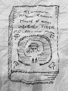
Q: Can you describe the design process for Sandy’s latest No 1 Ladies’ novel, The House of Unexpected Sisters?
A: The House of Unexpected Sisters involved soup and sandwich and napkins.
The week before I had a couple of false starts. Although I’d spent a decent amount of time on the drawing, the image just didn’t work. Sometimes things come very easily, but occasionally you need to look at artwork you’ve spent a couple of days working on, stop, and then launch it into the trash.
I met Sandy for lunch and we discussed The House of Unexpected Sisters. A lot of our sentences began with “What about . . . ?” As lunch progressed, we became more animated as we started making progress and finally achieved some clarity.
I jogged back to my studio full of new enthusiasm and immediately began work. I kept working into the evening and, when the illustration seemed to be coming together, put it away for the night.
Looking at your work in the morning can sometimes give you a fright—it’s never as good as you thought it was the night before. I was much relieved to find this drawing looked reasonably competent. I spent much of the day refining and tweaking and staring at it, then finally emailed my progress and it was pretty much done.
Q: What kind of advice would you offer to aspiring illustrators?
It’s always good to work on something that is reproduced in some form or another, and nowadays you also have the opportunity to publish digitally. Even if you’re only designing your own Christmas card or a drawing of your house, a picture transforms into an illustration when you reproduce it. You can learn what works by being involved in even the most limited and basic of print runs.
Remember that there’s a noble tradition drawing portraits of your neighbours’ pets—I’ve done it. Above all, don’t be discouraged. It’s all subjective!